When Midwest Orthopaedics at Rush (MOR) was planning its move to its sleek new quarters in the Perkins+Will-designed medical facility on the Rush Medical campus, a number of questions came to mind:
• How would patients find their way to the staggering number of specialists in the building?
• How could the slick space be rendered patient-friendly without compromising its contemporary, uncluttered feel?
• How would patients know they were in the right place altogether?
“Through art, we can address 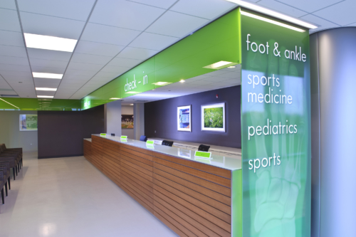 all these questions,” says H. Marion’s interior architect and designer Pam Rosenberg. “We can reinforce forward thinking and a cutting-edge image while softening some of the hard edges of the building.” Both Rosenberg and MOR’s Sports Medicine Head Dr. Bernie Bach emphasize the patient-centered approach they took in art selection.
“We want to help people move through the space in a way that eases their stress and tension,” she says. “We want to make them feel good about coming here,” he affirms, pointing to the inviting nature images in particular.
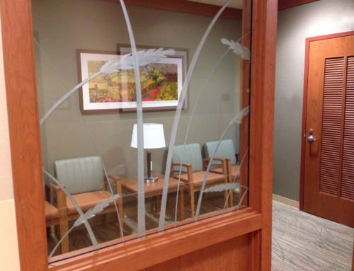
One of the potential stressors identified was how visitors would find the way to the correct waiting room, given the size of the practice (more than 40 specialists) and the facility it occupies. The new facility is on four floors, with 150,000 square feet of space: the size of a football field. Patients are seen on the fourth floor, where there are 60 examination rooms, four large waiting rooms, and long corridors leading to these areas and the x-ray facilities, plus sub-corridors off the waiting rooms.
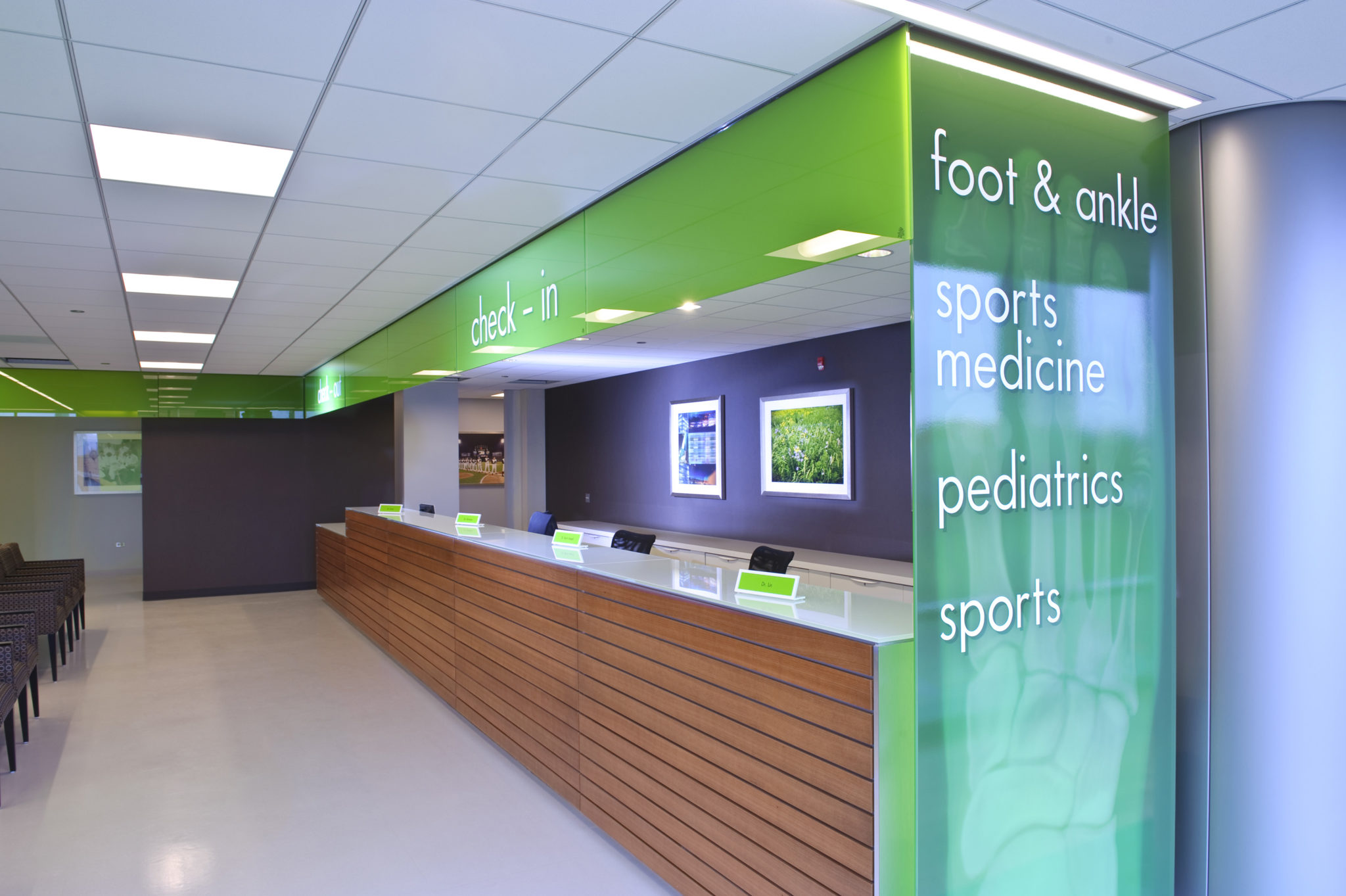
The architects had subdivided the fourth floor into four pods representing four sub-specialties, and color-coded each of the four waiting areas with a tinted glass wall. For example, green designates sports medicine, foot and ankle, while blue is for spine and hand surgery. You’d visit yellow for tumors or trauma, and orange for joint replacement.
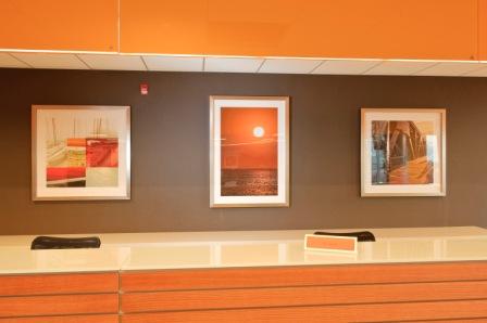 Inspired by these categorical color designations, the art consultants and committee came up with ingenious ways to reinforce the branding and color identity of the sub- specialty while ensuring consistency of aesthetic. In each of the four pods, the spacious waiting area has a 30-foot long surface behind which staff sits. On the wall above the surface hangs a serigraphic montage featuring a 3’ x 4’ nature scene in the dominant color of the particular pod, flanked on either side by two color-coordinated images of Chicago. The triptych provides an elegant and community-based emblem for the gathering place.
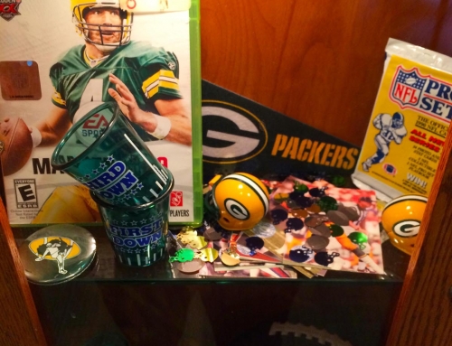
It’s evident that MOR’s involvement with sports and athletics influenced the choice of some of the art works. Visitors find 40 different installations of sports-related photos, memorabilia and art works, ranging from archival pictures of Comiskey Park and Wrigley Field (MOR looks after players on the White Sox and Bulls), to signed players’ jerseys, to team banners, and jerseys that were donated by some of Dr. Bach’s own patients who became All American (donations are acknowledged by a plaque.) Also included is the pediatric waiting area, complete with real bleacher seats from Comiskey Park surrounded by vivid hand-painted murals of a baseball stadium, placing the young fans in the middle of the action.
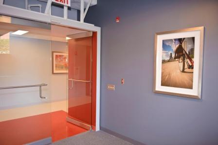 “We want to send the message to our patients of life and living, of activity and hope, not death and dying,” says Dr. Bach, who describes himself as “a nut for art” and is, himself a glass blower. He points out that they tried to be even handed in representation of sports, going beyond images of baseball and basketball players to include dancers, cyclists and rowers. Some of these images are courtesy of the talented photographers from Rush’s own Medical Photography Department.
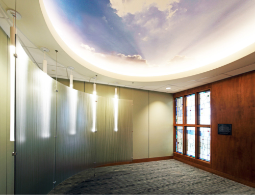
The artwork is displayed in a way that creates a specific rhythm, according to Rosenberg. She observes that, “The art all works together, like a beautiful quilt.” The light pouring through the wide windows and the arresting views of the Chicago skyline and Rush campus enhance the gallery-like quality. Special safety hardware ensures that the pictures cannot toggle or fall off the wall for the protection of visitors and artwork.
Rosenberg achieved aesthetic continuity through repeated use of wood molding, finished to resemble stainless steel. “It works beautifully with the contemporary feel of the building and is warmer and better quality than metal,” she avers. It’s also consistent with the silver LEED certification of the facility, as the frames are US-sourced and all inks used in the printing process for art works are nontoxic.
“I’m thrilled with how it turned out,” says Dr. Bach. “H. Marion did a great job — on budget, on time, and always available. They understood our goals and we ended up with the tasteful and appealing art we’d hoped for.”
“Of course,” he adds wryly, “We still have lots of wall space we can fill.”